Ai Overview
The Human Interface Guidelines (HIG) constitute Apple’s comprehensive design documentation, providing principles, recommendations, and best practices for creating applications across all Apple platforms. For example, an application might achieve greater visual distinctiveness by using custom controls—but at the cost of consistency with platform conventions. 5% of women, making color-independent design essential. Color blindness affects approximately 8% of men and 0.
Key Takeaways
- Apple’s Human Interface Guidelines (HIG) serve as the definitive design documentation for creating applications across iOS, iPadOS, macOS, watchOS, tvOS, and visionOS, with origins dating back to 1977 and the Apple II era.
- Four core design principles govern the HIG: Clarity ensures interfaces are easily understood, Deference keeps focus on content rather than UI elements, Depth uses visual layers to communicate hierarchy, and Consistency maintains familiar patterns across all Apple platforms.
- Following HIG significantly impacts App Store success as Apple reviewers evaluate user experience quality, and apps with poor adherence to guidelines face rejection risks that delay launches and increase development costs.
- Typography standards center on the San Francisco font family with SF Pro Text for sizes 19 points and below, SF Pro Display for 20 points and above, and Dynamic Type support enabling user-controlled text scaling for accessibility.
- Navigation patterns follow strict conventions including tab bars for top-level content switching (limited to five tabs on iPhone), navigation bars for hierarchical drill-down, and modal presentations for focused tasks requiring user decisions.
- Touch targets require minimum dimensions of 44×44 points as research demonstrates that smaller interactive elements result in 25% or higher tap error rates, particularly affecting users with motor impairments.
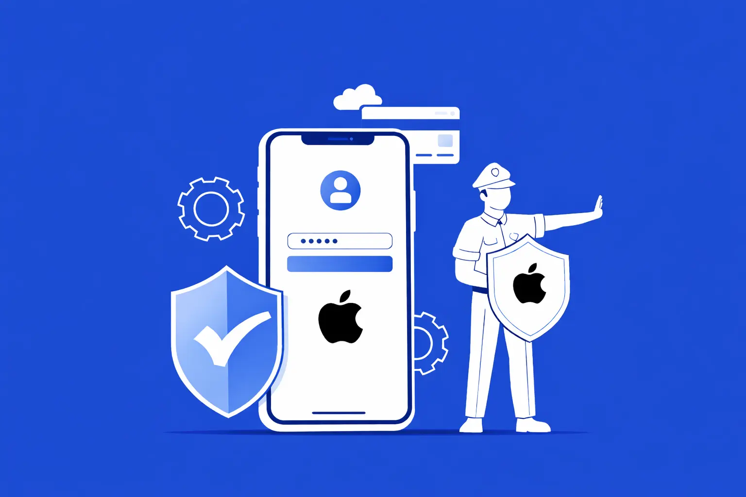
- Accessibility features are mandatory considerations including VoiceOver support, Dynamic Type implementation, sufficient color contrast ratios of at least 4.5:1, and alternative text for all meaningful images and icons.
- Recent HIG updates for 2025-2026 introduce guidance for visionOS spatial computing, customizable home screen widgets, Control Center extensions, the new Liquid Glass design language, and AI-powered features integration.
Creating applications that feel natural, intuitive, and seamlessly integrated within Apple’s ecosystem requires more than technical proficiency—it demands a deep understanding of design principles that have been refined over nearly five decades. Apple’s Human Interface Guidelines represent the accumulated wisdom of countless design iterations, user research studies, and platform evolution, distilled into a comprehensive resource that guides developers and designers toward creating exceptional user experiences.
At Nadcab Labs, our extensive experience developing iOS applications has demonstrated repeatedly that adherence to the Human Interface Guidelines distinguishes professional applications from amateur attempts. Applications that embrace these principles enjoy higher user retention, better App Store ratings, and significantly reduced support overhead. This comprehensive guide explores every essential aspect of the HIG, providing actionable insights that translate Apple’s design philosophy into practical implementation strategies.
The significance of the HIG extends beyond mere compliance with Apple’s preferences. These guidelines embody fundamental principles of human-computer interaction that have been validated through billions of user interactions across hundreds of millions of devices. Understanding why specific patterns exist—not just what they prescribe—empowers development teams to make intelligent design decisions even in situations the guidelines do not explicitly address.
Development Insight: Research from Nielsen Norman Group indicates that 72% of abandoned app sessions result from unclear navigation and confusing interfaces. Applications built following established platform conventions—like those in the HIG—dramatically reduce this abandonment rate by leveraging users’ existing mental models of how applications should behave.
1. What Are Apple Human Interface Guidelines?
Definition and Purpose
The Human Interface Guidelines (HIG) constitute Apple’s comprehensive design documentation, providing principles, recommendations, and best practices for creating applications across all Apple platforms. Unlike simple style guides that merely specify visual attributes, the HIG encompasses interaction patterns, navigation structures, accessibility requirements, and platform-specific considerations that together define what makes an application feel authentically native to Apple’s ecosystem.
The guidelines serve multiple critical functions. For designers, they establish visual standards including typography, color usage, iconography, and spatial relationships that create visual consistency with the broader Apple experience. For developers, they specify how standard components should behave, which system APIs to leverage, and how to implement interactions that feel responsive and natural. For product managers, they provide a framework for evaluating design decisions and predicting how users will respond to interface choices.
Perhaps most importantly, the HIG represents Apple’s design philosophy—a coherent worldview about how technology should serve people. This philosophy prioritizes content over chrome, clarity over complexity, and human needs over technological capabilities. Applications that internalize this philosophy don’t just look like Apple apps; they feel like natural extensions of the platform in ways that users recognize even if they cannot articulate why.
Historical Evolution
The history of the Human Interface Guidelines extends far longer than many developers realize. The earliest documented HIG dates to 1977, created for the Apple II personal computer—years before the Macintosh made graphical user interfaces mainstream. This remarkable longevity reflects Apple’s sustained commitment to user experience as a competitive differentiator, a commitment that has shaped the company’s identity for nearly half a century.
The 1984 Macintosh introduction brought the HIG into prominence, establishing foundational concepts like the menu bar, windows, icons, and mouse-driven interaction that would influence all subsequent personal computing. The original Macintosh HIG introduced principles that remain relevant today: consistency across applications, direct manipulation of objects, user control, and forgiveness (allowing users to undo mistakes). These principles were revolutionary at the time and have proven their durability through decades of technological change.
Evolution of Apple Human Interface Guidelines
Apple II guidelines establish early principles; Macintosh HIG defines GUI standards
iPhone introduces touch-first design; skeuomorphism guides early iOS
iOS 7 introduces flat design; clarity, deference, depth principles emerge
HIG consolidates platform guidance; widgets, visionOS introduced
Major visual redesign; translucency, depth, and fluid responsiveness
The introduction of iPhone in 2007 necessitated rethinking interface design for touch-first interaction on small screens. Early iOS guidelines emphasized skeuomorphic design—interfaces that mimicked real-world objects to help users understand digital metaphors. The Notes app resembled a legal pad; the bookshelf in iBooks looked like actual wooden shelves. While this approach aided initial comprehension, it eventually became limiting as users grew more sophisticated.
iOS 7 in 2013 marked the most significant visual transformation in Apple’s history, introducing flat design principles that removed skeuomorphic ornamentation in favor of clean typography, vibrant colors, and translucent layers. This redesign articulated the modern core principles—clarity, deference, and depth—that continue guiding iOS design today. Most recently, the 2022 HIG redesign consolidated previously separate platform guidelines into a unified resource, acknowledging that modern Apple development increasingly spans multiple platforms while preserving platform-specific details where necessary.
2. Core Design Principles of the Human Interface Guidelines
The Human Interface Guidelines are built upon foundational principles that inform every specific recommendation. Understanding these principles enables designers and developers to make sound decisions even in novel situations that the guidelines do not explicitly address. These principles have been refined through decades of user research and remain remarkably stable despite dramatic technological changes.
Clarity
Every element in the interface should be immediately understandable. Text must be legible at all sizes, icons should be precise and recognizable, and ornamentation should never obscure functionality. Users should comprehend what they can do on any screen without requiring instructions or experimentation.
Deference
The interface should defer to content, allowing what users care about to remain the focus. Chrome and controls should support rather than compete with content. Fluid motion, subtle gradients, and restrained visual styling help interface elements recede while content commands attention.
Depth
Visual layers and realistic motion convey hierarchy and spatial relationships. Translucency hints at content beneath surfaces. Parallax and scaling create a sense of vitality and three-dimensionality. These cues help users understand where they are within the app’s structure and navigate confidently.
Consistency
Applications should leverage familiar patterns and system components whenever possible. When users encounter standard controls behaving in expected ways, they can focus on your app’s unique value rather than learning new interaction paradigms. Consistency extends to terminology, visual styling, and gestural interactions.
Applying Principles in Practice
These principles interact and occasionally create tension that designers must resolve thoughtfully. For example, an application might achieve greater visual distinctiveness by using custom controls—but at the cost of consistency with platform conventions. The HIG generally favors consistency because the cognitive benefits of familiar patterns outweigh marginal visual differentiation. Users spend far more time with the operating system and other apps than with any single application, so leveraging their existing knowledge produces substantial usability benefits.
Deference requires particular discipline because designers naturally want their interface work to be noticed. However, the most successful iOS applications are those where the interface essentially disappears, allowing users to focus entirely on accomplishing their goals. Consider how the Camera app prioritizes the viewfinder above all else, or how the Notes app presents an almost blank canvas that foregrounds user content.
Depth has evolved significantly since iOS 7 first introduced flat design. Early interpretations sometimes produced interfaces that felt lifeless or confusing because they lacked sufficient visual hierarchy. Current guidelines emphasize using depth strategically—through layering, shadow, and motion—to communicate structure without returning to skeuomorphic literalism. Modal sheets that slide up from the bottom, for instance, clearly communicate that they exist “above” the underlying content and will need to be dismissed.
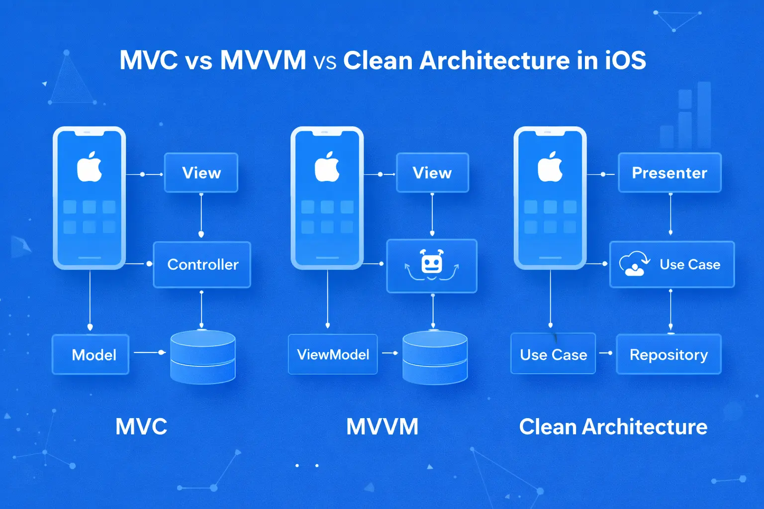
3. Navigating the Human Interface Guidelines Structure
The Human Interface Guidelines are organized into six major categories, each addressing different aspects of application design. Understanding this structure helps designers and developers locate relevant guidance efficiently and comprehend how different aspects of design interconnect. Many practitioners find the HIG overwhelming initially, but the logical organization becomes intuitive with familiarity.
Platforms Category
The Platforms section provides essential context for designing on each Apple operating system. While many design principles transfer across platforms, each has unique characteristics that require specific consideration. iOS design must account for one-handed operation, cellular connectivity constraints, and the intimate nature of a device carried constantly. iPadOS extends iOS patterns while introducing multitasking, larger displays, and more precise input through Apple Pencil. macOS accommodates pointer-based interaction, window management, and the productivity-focused workflows typical of desktop computing.
The newest platform, visionOS for Apple Vision Pro, introduces spatial computing concepts that fundamentally rethink how interfaces exist in three-dimensional space. Understanding platform differences helps developers create applications that feel native on each device rather than awkward ports that ignore platform conventions. At Nadcab Labs, we emphasize platform-specific optimization even when developing cross-platform applications, ensuring that users on each device receive experiences tailored to their context.
Foundations Category
Foundations encompass the building blocks from which all interfaces are constructed. This category covers accessibility requirements that ensure applications are usable by people with various disabilities—not merely a legal consideration but an ethical obligation and business opportunity given the significant disabled population. Color guidelines explain semantic color usage, contrast requirements, and how to support both light and dark appearances effectively.
Typography guidance specifies how to use Apple’s San Francisco font family effectively, including Dynamic Type support that allows users to adjust text sizes according to their preferences. Layout principles cover spacing, alignment, and grid systems that create visual harmony. Motion guidelines describe how animation should communicate change, provide feedback, and enhance spatial understanding without causing discomfort or distraction.
4. Typography and the San Francisco Font System
Typography forms the backbone of interface design, conveying hierarchy, tone, and accessibility. Apple’s Human Interface Guidelines place particular emphasis on typographic excellence, providing the San Francisco font family specifically designed for screen legibility across Apple’s range of devices and display technologies. Understanding how to apply these typographic standards distinguishes polished professional applications from amateur efforts.
The San Francisco Font Family
San Francisco, introduced in 2014, represents Apple’s first custom typeface in nearly twenty years. The font was designed from the ground up for optimal legibility on digital screens, incorporating optical sizing that automatically adjusts letterform details based on display size. San Francisco exists in several variants optimized for different contexts: SF Pro for iOS, iPadOS, macOS, and tvOS interfaces; SF Compact for watchOS where the smaller display demands more efficient letter shapes; and SF Mono for programming contexts requiring character alignment.
The optical sizing feature represents particularly sophisticated typography. SF Pro Text, used for body text at 19 points and smaller, features wider letter spacing and slightly heavier strokes that maintain legibility at small sizes. SF Pro Display, for 20 points and larger, uses tighter spacing and more refined strokes appropriate for headline-size text. The system handles this distinction automatically when using system APIs, but designers working in mockups must select the appropriate variant manually.
iOS Text Style Specifications
Regular weight, primary screen headers
Regular weight, section headers
Regular weight, subsection headers
Semibold weight, emphasized content
Regular weight, standard text
Regular weight, secondary information
Regular weight, labels and captions
Regular weight, minimum readable size
Dynamic Type and Accessibility
Dynamic Type allows users to select their preferred text size system-wide, with applications automatically adjusting to honor these preferences. Supporting Dynamic Type is not optional for accessible applications—it enables people with visual impairments to use applications that would otherwise be illegible. The HIG requires maintaining a minimum font size of 11 points even at the smallest Dynamic Type setting, ensuring baseline readability.
Implementing Dynamic Type requires thoughtful layout design that accommodates significant size variations. Text that fits comfortably at default sizes may overflow containers at larger accessibility sizes. Professional applications design flexible layouts that gracefully adapt, allowing text to wrap, containers to expand, and information to reorganize as needed. This flexibility benefits all users, not just those requiring larger text—anyone may temporarily increase text size in bright sunlight or other challenging viewing conditions.
Custom fonts require additional implementation effort to support Dynamic Type properly. Unlike system fonts that automatically scale, custom fonts must be explicitly configured to respond to text size preferences. The HIG strongly recommends using system fonts unless branding requirements demand otherwise, as custom fonts frequently compromise legibility while adding implementation complexity and increasing application size.
5. Navigation Patterns and Information Architecture
Navigation determines how users move through an application and represents one of the most critical aspects of interface design. Poor navigation creates confusion, frustration, and abandonment; excellent navigation becomes invisible, allowing users to focus entirely on accomplishing their goals. The Human Interface Guidelines define specific navigation patterns with established user expectations that applications should leverage.
Tab Bar Navigation
The tab bar provides global navigation for top-level application sections, appearing persistently at the screen bottom throughout the application. Tab bars establish the primary information architecture, communicating the app’s main capabilities through concise labels and intuitive icons. Users develop strong expectations about tab bar behavior—each tab should reveal distinct content sections, and the selected tab should never change without explicit user interaction.
The HIG recommends limiting tab bars to five items on iPhone, as additional tabs create cramped touch targets and cognitive overload. When more sections are necessary, the rightmost position becomes a “More” tab leading to additional options. iPad applications may display more tabs due to larger screens, and adaptive layouts should adjust tab bar presentation appropriately. Tab bar icons should use a consistent visual style—solid filled icons for selected states, outlined icons for unselected states—helping users immediately identify their current location.
Tab Bar
Provides access to top-level sections. Always visible at screen bottom. Limited to 3-5 tabs on iPhone. Each tap switches content instantly without animation suggesting hierarchical change.
Best for: Apps with distinct parallel sections (Music, Photos, App Store)
Navigation Bar
Enables hierarchical drill-down through content levels. Shows current location title and back button. Push/pop transitions communicate depth. Large titles collapse on scroll for content focus.
Best for: Content hierarchies (Settings, Mail, Files)
Modal Presentation
Focuses attention on self-contained tasks. Slides up from bottom, overlaying previous content. Requires explicit dismissal. Uses for composition, editing, or decisions requiring commitment.
Best for: Creating content, making selections, focused workflows
Hierarchical Navigation
Hierarchical navigation, implemented through navigation controllers and navigation bars, enables users to drill down through increasingly specific content levels. The push transition—new content sliding in from the right while previous content slides left—establishes a spatial metaphor where “deeper” content exists to the right. The back button in the navigation bar’s top-left corner provides consistent return navigation, with the label indicating the destination screen title.
Disclosure indicators (chevrons) in list rows communicate that tapping will reveal additional content, distinguishing navigable rows from informational ones. This visual cue sets appropriate expectations and helps users predict interaction outcomes. Large titles, introduced in iOS 11, display prominently when content is scrolled to the top and collapse into the navigation bar during scrolling, maximizing content visibility while maintaining orientation.
Modal Presentations
Modal presentations create focused contexts for tasks that require completion or explicit dismissal before returning to the underlying content. The sheet presentation style, sliding up from the bottom and partially covering previous content, communicates temporary overlay status. Full-screen modals are appropriate when immersive focus is needed, such as photo editing or document composition.
Modal presentations should include clear completion and cancellation options, typically through navigation bar buttons labeled “Done” and “Cancel” or contextual variations. The interactive dismissal gesture—swiping down on a sheet—provides convenient dismissal but should be disabled when dismissal would lose unsaved changes. Overusing modals fragments the user experience and creates “modal fatigue,” so hierarchical navigation should be preferred when content relationships justify it.
6. Accessibility: Designing for Everyone
Accessibility is not an optional enhancement but a fundamental requirement for creating professional iOS applications. Apple’s Human Interface Guidelines establish specific accessibility standards that ensure applications are usable by people with visual, motor, auditory, and cognitive disabilities. Beyond ethical obligations, accessibility compliance affects App Store approval, as reviewers specifically evaluate accessibility features.
VoiceOver and Screen Reader Support
VoiceOver enables visually impaired users to navigate applications through auditory descriptions of interface elements. Every interactive element must have a meaningful accessibility label that VoiceOver can announce. System components provide appropriate labels automatically, but custom controls and images require explicit accessibility configuration. Labels should describe the element’s purpose rather than its visual appearance—”Submit Order” rather than “Blue Button.”
Accessibility hints provide additional context about element behavior, announced after the label with a brief pause. Traits communicate element types (button, link, header) that affect VoiceOver navigation behavior and user expectations. Proper accessibility implementation requires testing with VoiceOver enabled, navigating through screens sequentially to ensure logical reading order and complete coverage of all functionality.
Essential Accessibility Requirements
Touch Targets
Minimum 44×44 points for all interactive elements. Research shows 25%+ tap errors with smaller targets, particularly affecting users with motor impairments.
Color Contrast
Minimum 4.5:1 contrast ratio for normal text, 3:1 for large text. Never convey information through color alone—always provide additional indicators.
Dynamic Type
Support user-selected text sizes from smallest to largest accessibility sizes. Layouts must adapt without truncation or overlap.
Motion Sensitivity
Respect the Reduce Motion setting by minimizing parallax effects, replacing sliding transitions with crossfades, and avoiding autoplay animations.
Color and Visual Design Considerations
Color blindness affects approximately 8% of men and 0.5% of women, making color-independent design essential. Information conveyed through color should always have alternative indicators—icons, patterns, or text labels—that communicate the same meaning to users who cannot perceive color differences. Status indicators, validation states, and categorical distinctions require careful design to remain comprehensible without color.
Contrast requirements ensure text legibility for users with reduced visual acuity. The HIG specifies minimum contrast ratios based on WCAG guidelines: 4.5:1 for normal-sized text, 3:1 for large text (18pt regular or 14pt bold). Testing contrast is straightforward with numerous free tools available, and insufficient contrast represents one of the most common and easily correctable accessibility failures.
7. App Icons and Visual Identity
The application icon represents the user’s first impression and ongoing visual identifier within their device. An effective icon communicates the app’s purpose instantly while maintaining visual distinctiveness among hundreds of competing icons. The Human Interface Guidelines provide specific technical requirements and design principles that help icons succeed in Apple’s ecosystem.
Icon Design Principles
Simplicity is paramount for icon design. Icons appear at various sizes from tiny notification badges to large App Store features, and excessive detail becomes illegible at smaller scales. Effective icons use simple shapes, limited color palettes (typically two to three colors), and avoid text that becomes unreadable when scaled down. The most memorable icons convey meaning through a single strong visual concept rather than complex literal representations.
Apple’s design grid provides a framework for icon composition, though even Apple’s own icons don’t adhere strictly to every gridline. The grid helps ensure visual balance and proper proportions, with optical adjustments sometimes necessary to achieve perceived alignment. Icons should fill the available space appropriately—neither cramped against edges nor floating in excessive empty space.
Recent iOS versions have introduced appearance variations for app icons. Icons now require light, dark, and tinted versions to integrate with user-customized home screens. The dark appearance typically involves subtle adjustments to maintain visibility against dark backgrounds, while tinted versions allow the icon to adopt the user’s chosen accent color. Testing icons against various wallpapers and appearance settings ensures consistent quality across contexts.
8. Human Interface Guidelines vs. Material Design
Designers and developers frequently work across both iOS and Android platforms, making understanding the differences between Apple’s Human Interface Guidelines and Google’s Material Design essential. While both systems aim to create excellent user experiences, their philosophical approaches and specific implementations differ significantly. Cross-platform applications that ignore these differences feel foreign on at least one platform.
Philosophical Differences
The Human Interface Guidelines emphasize flat design with depth conveyed through translucency, layering, and motion. Interface elements appear as thin, precise overlays that defer to content. In contrast, Material Design embraces a more literal material metaphor where interface elements simulate physical surfaces with consistent shadow behavior, elevation, and material properties like paper or ink.
Navigation patterns differ substantially. iOS favors bottom-positioned tab bars for primary navigation, while Android traditionally uses top-positioned tabs and navigation drawers (hamburger menus). Research has demonstrated that bottom navigation is more thumb-accessible on modern large phones, leading Android to increasingly adopt bottom navigation—but the HIG established this pattern much earlier.
Human Interface Guidelines (iOS)
Flat design with translucent blur effects
Bottom tab bar for primary navigation
San Francisco system font family
Edge-to-edge swipe for back navigation
Date pickers with scrolling wheels
Emphasis on content over chrome
Material Design (Android)
Material surfaces with elevation shadows
Navigation drawer (hamburger menu) common
Roboto system font family
System back button for navigation
Calendar-style date pickers
Floating action buttons for primary actions
Cross-platform frameworks like Flutter and React Native provide capabilities to render platform-appropriate interfaces, but require intentional design effort to achieve truly native experiences on each platform. At Nadcab Labs, we recommend designing platform-specific interfaces rather than lowest-common-denominator approaches that satisfy neither platform’s users. The additional design effort is repaid through better user satisfaction, higher ratings, and improved retention metrics.
9. Recent Updates and Future Directions
The Human Interface Guidelines evolve continuously to address new devices, capabilities, and user expectations. Staying current with guideline updates ensures applications remain modern and take advantage of new platform capabilities. Recent years have brought particularly significant changes as Apple expands into spatial computing while continuing to refine its established platforms.
WWDC 2024 Updates
The 2024 guidelines update introduced extensive new guidance responding to iOS 18’s expanded customization capabilities. Users can now tint their home screens and customize icon appearances, requiring developers to provide icon variants that maintain visual quality across light, dark, and tinted presentations. Widget guidelines expanded to address accented widgets that adapt to user-chosen color schemes.
The Controls system, allowing applications to extend functionality into Control Center, Lock Screen, and the Action button, received comprehensive documentation. Game-specific guidelines emerged as a completely new section, recognizing that game experiences often require different approaches than productivity applications while still benefiting from platform integration.
visionOS and Spatial Computing
Apple Vision Pro introduced visionOS guidelines that fundamentally reconsider interface design for spatial computing. Windows float in three-dimensional space, eye tracking and hand gestures replace touch, and immersive experiences blend digital content with the physical environment. These guidelines address entirely new considerations: comfortable viewing distances, appropriate window sizes in spatial contexts, and designing for an environment where users remain aware of their surroundings.
The immersive experiences guidance helps developers understand when to use full immersion versus passthrough modes that let users see their environment. Depth cues, volumetric content, and spatial audio all receive detailed treatment. While visionOS represents a small installed base currently, the guidelines provide valuable insight into Apple’s vision for computing’s future.
Liquid Glass Design Language (2026)
Looking forward, Apple has announced the Liquid Glass design language for iOS 26 and related operating systems, representing the most significant visual redesign since iOS 7. This new approach emphasizes translucency, depth, and fluid responsiveness across all platforms. Interface elements adopt a glass-like appearance with dynamic tinting based on underlying content. Applications will need updates to align with this new aesthetic while maintaining functional consistency.
Staying Current with HIG Updates
Apple maintains a “What’s New” section in the HIG documentation that highlights recent changes. Subscribing to Apple’s developer news and attending WWDC sessions—either live or through session recordings—ensures awareness of guideline evolution. At Nadcab Labs, we monitor these updates continuously to ensure client applications remain current with Apple’s expectations and take advantage of new capabilities.
10. Implementation Best Practices
Understanding the Human Interface Guidelines intellectually differs from applying them effectively in production applications. This section provides practical guidance for integrating HIG principles into development workflows, ensuring that guideline compliance becomes a natural part of the development process rather than an afterthought addressed during review preparation.
Start with System Components
Default to UIKit or SwiftUI system components before creating custom implementations. System components automatically handle accessibility, Dynamic Type, appearance adaptations, and future platform updates. Custom components require significantly more implementation effort and ongoing maintenance to match system component quality.
Design with Accessibility First
Incorporate accessibility from initial design rather than retrofitting. Ensure all interactive elements have 44x44pt minimum touch targets, verify contrast ratios during color selection, plan layouts that accommodate Dynamic Type scaling, and test with VoiceOver throughout development.
Test on Physical Devices
Simulators cannot replicate touch responsiveness, gesture fluidity, or real-world viewing conditions. Test on the full range of supported devices, including oldest supported models where performance limitations may reveal issues invisible on newer hardware. Test in various lighting conditions and orientations.
Review Apple’s First-Party Apps
Apple’s built-in applications serve as reference implementations for HIG principles. Study how Notes, Mail, Messages, and other apps handle navigation, present content, manage state, and adapt to different contexts. These apps demonstrate guideline application more concretely than documentation alone.
Document Design Decisions
When departing from standard patterns, document the reasoning. HIG principles sometimes conflict, requiring judgment about which to prioritize. Documenting decisions helps maintain consistency as teams change and ensures App Store reviewers understand intentional choices versus oversights.
Common Compliance Mistakes
Certain HIG violations appear frequently in App Store rejections and user complaints. Touch targets smaller than 44×44 points cause user frustration and accessibility failures. Custom navigation patterns that prevent edge swipe back gestures confuse users accustomed to system behavior. Ignoring the safe area on notched devices causes content to disappear behind the sensor housing or home indicator.
Modal overuse creates fragmented experiences where users lose track of their location within the app. Inconsistent use of destructive action colors—particularly using red for non-destructive actions—violates user expectations established by system conventions. Poor dark mode support, including text that becomes illegible or images that lack appropriate dark variants, creates an unfinished appearance that damages user perception.
Conclusion: Mastering Human Interface Guidelines
Apple’s Human Interface Guidelines represent nearly five decades of refined thinking about human-computer interaction, distilled into actionable guidance for creating exceptional applications. These guidelines are not arbitrary constraints but evidence-based principles validated through billions of user interactions across hundreds of millions of devices. Understanding and applying them distinguishes professional applications from amateur attempts.
The four core principles—clarity, deference, depth, and consistency—provide a framework for making design decisions even in situations the guidelines do not explicitly address. Typography standards centered on the San Francisco font family ensure legibility and accessibility. Navigation patterns establish user expectations that, when honored, make applications feel immediately intuitive. Accessibility requirements ensure applications serve all users, not just those with typical abilities.
Successful HIG implementation requires more than mechanical compliance with specific rules. It demands internalizing Apple’s design philosophy and applying it thoughtfully throughout the development process. Teams that treat guidelines as a checklist to satisfy during review preparation miss the deeper benefits of designing with HIG principles from project inception.
At Nadcab Labs, our extensive iOS development experience has demonstrated repeatedly that HIG adherence correlates strongly with application success metrics—higher ratings, better retention, reduced support burden, and smoother App Store approval. We bring this expertise to every client engagement, ensuring that applications not only meet Apple’s technical requirements but embody the design excellence that users have come to expect from the iOS platform.
Ready to Build Exceptional iOS Applications?
Nadcab Labs combines deep Human Interface Guidelines expertise with extensive iOS development experience to create applications that delight users and succeed in the App Store. From initial concept through deployment and ongoing optimization, our team ensures your application embodies Apple’s design standards while achieving your business objectives.
FREQUENTLY ASKED QUESTIONS
Q1.What are Apple Human Interface Guidelines?
Apple Human Interface Guidelines (HIG) are comprehensive design documentation that provides principles, recommendations, and best practices for creating applications across all Apple platforms including iOS, iPadOS, macOS, watchOS, tvOS, and visionOS. The guidelines cover visual design standards, interaction patterns, navigation structures, accessibility requirements, and platform-specific considerations. Dating back to 1977 with the Apple II, the HIG represents Apple’s accumulated wisdom about human-computer interaction, helping developers create applications that feel native to Apple’s ecosystem and meet user expectations for quality and usability.
Q2.What are the core principles of iOS design according to HIG?
The Human Interface Guidelines define four core principles for iOS design. Clarity ensures every interface element is immediately understandable with legible text and precise icons. Deference means the interface should defer to content, allowing what users care about to remain the focus while controls support rather than compete. Depth uses visual layers, translucency, and motion to convey hierarchy and spatial relationships. Consistency leverages familiar patterns and system components so users can apply existing knowledge. These principles work together to create interfaces that feel intuitive and native to Apple platforms.
Q3.Why is following Apple HIG important for App Store approval?
Following Apple’s Human Interface Guidelines significantly impacts App Store approval success. Apple reviewers evaluate user experience quality, and apps with poor adherence to guidelines face rejection risks that delay launches and increase development costs. Specifically, reviewers check for accessibility compliance (VoiceOver support, Dynamic Type, proper touch targets), appropriate navigation patterns, correct use of system components, and overall user experience quality. Apps that violate guidelines often receive rejection notices requiring costly revisions before resubmission. Beyond approval, HIG-compliant apps typically achieve higher user ratings, better retention, and reduced support overhead.
Q4.What font should I use for iOS app development?
Apple recommends using the San Francisco (SF) font family for iOS applications. SF Pro is the primary system font for iOS, iPadOS, macOS, and tvOS, designed specifically for optimal screen legibility. Use SF Pro Text for body text at 19 points or smaller, and SF Pro Display for text at 20 points or larger. The font features optical sizing that automatically adjusts letterform details based on display size. San Francisco includes nine weights from Ultralight to Black, supports Dynamic Type for user-controlled text scaling, and integrates seamlessly with SF Symbols for iconography. While custom fonts are permitted, they must maintain legibility and support accessibility features.
Q5.What is the minimum touch target size for iOS apps?
Apple’s Human Interface Guidelines require a minimum touch target size of 44×44 points for all interactive elements. Research demonstrates that buttons and interactive elements smaller than this threshold result in 25% or higher tap error rates, particularly affecting users with motor impairments. This requirement applies to buttons, links, table rows, and any other tappable interface elements. While visual elements may appear smaller, the tappable area must meet the 44×44 point minimum. Proper spacing between touch targets is equally important to prevent accidental activation of adjacent controls.
Q6.What is the difference between tab bars and navigation bars in iOS?
Tab bars and navigation bars serve different navigation purposes in iOS applications. Tab bars appear at the screen bottom and provide global navigation between top-level app sections, allowing users to switch instantly between peer content areas. They should contain 3-5 tabs on iPhone and remain visible throughout the app. Navigation bars appear at the screen top and enable hierarchical drill-down navigation through content levels, showing the current location title and a back button for returning to previous screens. Tab bars organize parallel content sections (like Music’s Library, Browse, Radio), while navigation bars traverse depth within a single section (like Settings menus).
Q7.How do Apple HIG differ from Google Material Design?
Apple’s Human Interface Guidelines and Google’s Material Design represent different philosophical approaches to interface design. HIG emphasizes flat design with translucent blur effects and depth conveyed through layering, while Material Design uses a literal material metaphor with elevation shadows simulating physical surfaces. HIG favors bottom tab bars for primary navigation; Material Design traditionally uses navigation drawers and top tabs. HIG uses San Francisco fonts; Material Design uses Roboto. iOS supports edge-swipe for back navigation; Android uses system back buttons. Date pickers differ significantly—iOS uses scrolling wheels while Android uses calendar views. Cross-platform apps should respect each platform’s conventions rather than forcing one design system onto both.
Q8.What accessibility features are required by Apple HIG?
Apple’s Human Interface Guidelines require several accessibility features for App Store compliance. VoiceOver support requires meaningful accessibility labels for all interactive elements. Dynamic Type support allows text to scale based on user preferences, with layouts that accommodate size changes without truncation. Color contrast must meet minimum 4.5:1 ratio for normal text and 3:1 for large text. Information should never be conveyed through color alone. Touch targets must be at least 44×44 points. Apps should respect the Reduce Motion setting by minimizing animations. Alternative text is required for meaningful images. Proper accessibility traits must indicate element types (button, link, header) for screen reader navigation.
Q9.What are the latest updates to Apple Human Interface Guidelines?
Recent Human Interface Guidelines updates include extensive iOS 18 customization guidance covering tinted home screens, icon appearance variants (light, dark, tinted), and accented widgets. New Controls documentation addresses extending app functionality into Control Center, Lock Screen, and Action button. visionOS guidance covers spatial computing concepts for Apple Vision Pro including window placement in 3D space, eye tracking, and hand gesture interaction. A comprehensive “Designing for Games” section provides game-specific guidance. Looking ahead, iOS 26 introduces the Liquid Glass design language with translucent glass-like interface elements and unified aesthetics across all Apple platforms.
Q10.Where can I access Apple Human Interface Guidelines?
Apple’s Human Interface Guidelines are freely accessible at developer.apple.com/design/human-interface-guidelines/. The documentation is organized into six main categories: Platforms (iOS, iPadOS, macOS, watchOS, tvOS, visionOS), Foundations (accessibility, color, typography, layout), Patterns (navigation, search, sharing), Components (buttons, menus, navigation bars), Inputs (touch, keyboard, gestures), and Technologies (Siri, widgets, notifications). The site includes visual examples, search functionality, and links to related developer documentation and WWDC videos. Apple also provides design resources including Sketch and Figma templates, SF Symbols library, and San Francisco font downloads at developer.apple.com/design/resources/.
Explore Services
Related Services
Reviewed by

Aman Vaths
Founder of Nadcab Labs
Aman Vaths is the Founder & CTO of Nadcab Labs, a global digital engineering company delivering enterprise-grade solutions across AI, Web3, Blockchain, Big Data, Cloud, Cybersecurity, and Modern Application Development. With deep technical leadership and product innovation experience, Aman has positioned Nadcab Labs as one of the most advanced engineering companies driving the next era of intelligent, secure, and scalable software systems. Under his leadership, Nadcab Labs has built 2,000+ global projects across sectors including fintech, banking, healthcare, real estate, logistics, gaming, manufacturing, and next-generation DePIN networks. Aman’s strength lies in architecting high-performance systems, end-to-end platform engineering, and designing enterprise solutions that operate at global scale.